
In March, Vanderbilt University launched a refreshed visual identity designed to reflect the university’s forward momentum and to build pride and visibility across the institution, including its athletics program.
“As we prepare to celebrate our 150th anniversary next year, it’s time for Vanderbilt to sharpen our expression of who we are and what makes us unique,” Chancellor Daniel Diermeier says. “This new visual identity is designed to help build and share the pride in our collaborative community and to bring greater visibility to our university across the country and around the world.”
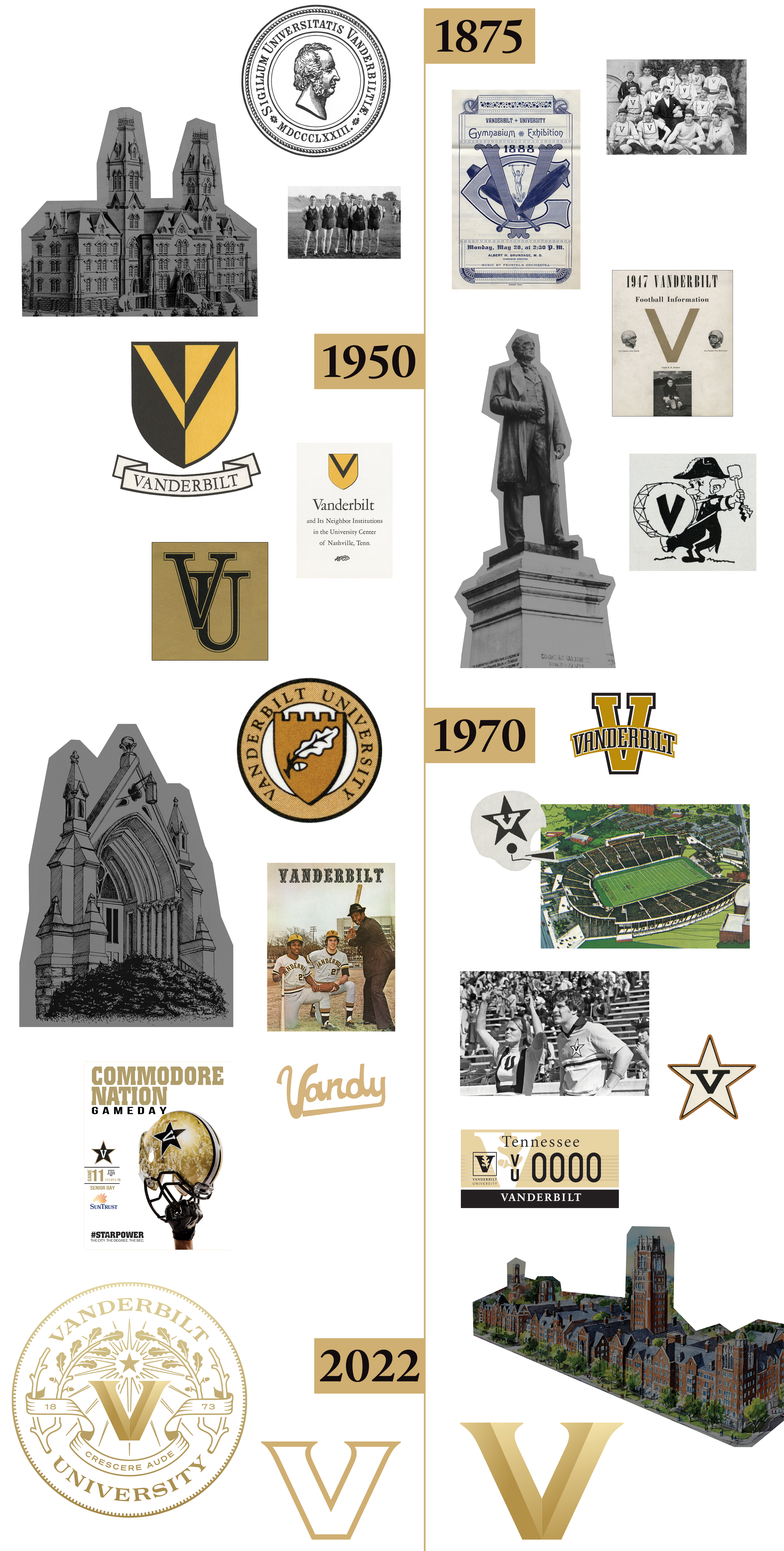
The refresh includes a redesigned university seal, featuring a new Latin motto: Crescere aude, which translates to “dare to grow.” The seal’s components include a strong V mark that serves as a connecting symbol across the university; Vanderbilt’s founding year; oak branches, which are part of the Vanderbilt family crest; and references to navigation, including a star and compass elements signifying charting a forward course together. The same V mark has been incorporated into an updated primary logo for athletics.
Steve Ertel, vice chancellor for communications and marketing, led the visual identity refresh, and Candice Lee, BS’00, MEd’02, EdD’12, vice chancellor for athletics and university affairs and athletic director, was a key partner in the effort.
“From my perspective, the timing is perfect in that it illustrates the ‘new era’ that we have spoken of often,” Lee says. “It’s a new day, with new energy, alignment and momentum to match. It’s another example of ‘Vandy United’ in action.”