


Editor’s Note: Nikki Usher is an assistant professor at The George Washington University’s School of Media and Public Affairs where she studies the changing digital media landscape. She is the author of “Interactive Journalism: Hackers, Data, and Code,” and “Making News at The New York Times.” The views expressed are her own.
Story highlights
Nikki Usher: News organizations can build tremendous traffic from their interactives
But interactives can also be dangerously unrepresentative of the actual complexity of the world, she says
What journalists can do today with interactive graphics and data visualizations was unimaginable even just 10 years ago.
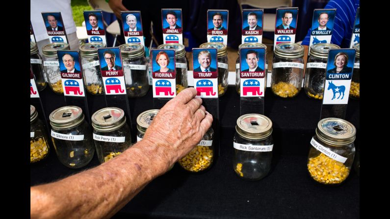
Now, sophisticated teams of journalists at the nation’s biggest news organizations crunch numbers, visualize them, and often, make them clickable and engaging enough to keep you clicking, clicking, and exploring. They also put special emphasis on elections, often planning projects close to a year out.

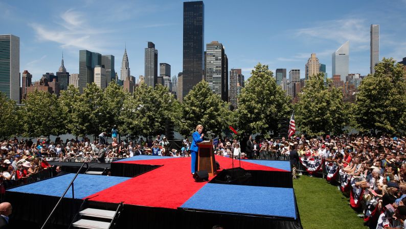
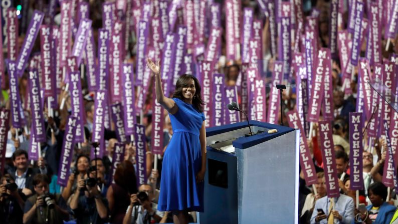
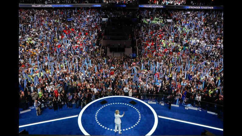
News organizations can build tremendous traffic from their interactives at a time of troubling digital economics, but there are serious repercussions for the public thanks to this blossoming of interactives. Indeed, bad data may not only have contributed to Democrats’ confidence about the outcome of the election, but given a boost to bad data visualization itself.
Jim Rutenberg at The New York Times took his own paper to task last week for creating a sense of certainty that belied the complexity before the country. “Data journalism in particular … was under fire after guiding audiences – often through visually appealing speedometer-type graphics that forecast the probability of winning – to the conclusion that Mrs. Clinton would prevail in electoral votes.”
Visualizing data as if it represents certainty is a serious problem. People consume information more quickly and effectively if it is visualized, but poor presentation and lack of context can lead to misinformation.
A gamification of this data didn’t help Democrats, either. Nate Silver’s forecast became a way for friends I know to reduce anxiety, but it made the data look too simple and made it all too easy for Democrats to click refresh each day and be reassured that the numbers favored blue.
Clear, crisp numbers did make it easier for those worried about the election to take a deep breath. But the percentages alone don’t represent the uncertainty that is clearly mentioned in every poll. In fact, some pollsters have defended their work by arguing that the confidence intervals of their work did account for the Trump victory, at least to some degree.
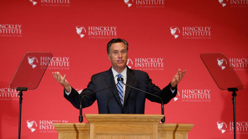
In fact, the national polling error wasn’t actually that bad – 2% to 3%, about the same as the errors made in 2012 that failed to predict Mitt Romney’s resounding defeat to President Obama. But the visualizations didn’t account for error, and instead, in bright lines, seductive clicks and neat pop-ups, told an interactive tale about an election outcome that simply wasn’t.

Yet even if a key problem with the polls was the failure to accurately predict voter turnout, there were many other reasons to treat the polls with caution, and visualize accordingly.
In my classroom at George Washington University, my students in research methods learned about very obvious polling issues, such as a tendency for partisans not to answer polls after a bad news cycle for the candidate they favored, which might explain numbers that consistently favored Clinton.
But the sheer meaninglessness of bad data visualization really came to the forefront on election night when The New York Times’ election predictor dial – the one that swung back and forth and changed in unpredictable intervals – underscored the extent to which we had become addicted to easy, clickable data journalism for answers.
As a Gizmodo writer noted in an article on election night titled, “The New York Times Live Presidential Election Meter is F—ing with Me,” we now had a fixation with interactives – and in particular, this one operating in real time. He had his colleagues help him describe the attraction of the graphic as the dial turned from Hillary to Trump; it was as if “they figured out how to shoot election heroin straight into our veins” an “IV drip of election drugs” but also, at the same time, “a meaningless representation of nothing.”
And it’s not much better after the election, despite this being precisely the time when an objective post-mortem needs to take place across partisan divides.
Consider this: The New York Times’ electoral map reveals solidly blue states, namely California, Washington, New York, and solidly red states – Alabama, South Carolina and Mississippi. Virginia, post-election, is also a solid blue. Each state on the map has an interactive scroll that provides a clear sign who won it.
But the reality is much more complicated than the neat red, blue and slightly shaded varieties of the color. The Times also provides a county-level map, but to get to it, you have to know to navigate below the user-friendly aggregate map.
And if you were to click on the counties, you’d find the story is far more complicated. Almost the entirety of New York, from a geographic perspective, is red, even though on an aggregate level, it is a blue state. California is blue, but only on its long coast, not inland.
Inside South Carolina, there are a slew of counties that went solidly blue – visually about as many as went blue in North Carolina. Another band of blue (which I can’t explain) runs in between Mississippi and Alabama. It’s hard to figure out what those places are, though, because there is no sense of where the cities fall on these blue and red counties.
This post-election electoral map is full of opportunities to misinterpret visual data, and to miss insights that might come from it were it done more successfully.
While I don’t expect Mississippi to ever go blue, the band of blue is curious. And with South Carolina getting an influx of out-of-state population in its coastal center (Charleston was voted best city in the United States by Travel and Leisure in 2015) and growing state universities (Clemson, winner of the 2015 BCS), is it completely impossible to think that one day it might change?
All this suggests that graphing data, simplifying it and making it easy to understand and fun to play with has some serious problems: It oversimplifies, obscures and makes real insights harder to come by.
That’s not to say that in some cases, visualizing data can’t make the story clearer. And social scientists rely on graphs, maps and charts to clarify complicated statistical findings. But most of us visualizing data are not trying to also write a headline or make an interactive people will click on. Social science looks for the complete story behind the data, but even in data journalism, it is all too tempting to cut to the quickest, clearest and cleanest data presentation that provides the equivalent of visual nut graph.
News organizations have made this kind of interactive journalism a priority in the past five years, and even now, news organizations are still willing to invest in new jobs for programmers and data scientists, even while they are making cuts in other parts of the newsroom. That’s a good thing, but it’s also important to be a cautious consumer of this work.
You’re going to see more and more of this. It’s addicting to users, perfect for Internet news consumption and beneficial to news organizations’ bottom lines. But it can also be dangerously unrepresentative of the actual complexity of the world around us.