

We love these rebrands
Every year, the Super Bowl offers advertisers a huge opportunity (at a huge price tag) to capture attention for their brands. So around the end of the prior year, there are a flurry of “rebranding” campaigns, hinting at what consumers may see by the time we’re in February.And OMG! We’re in February. Our creative team fell in LOVE with a few of these national rebranding endeavors. But the one taking the crown over the others is—you guessed it—Burger King!
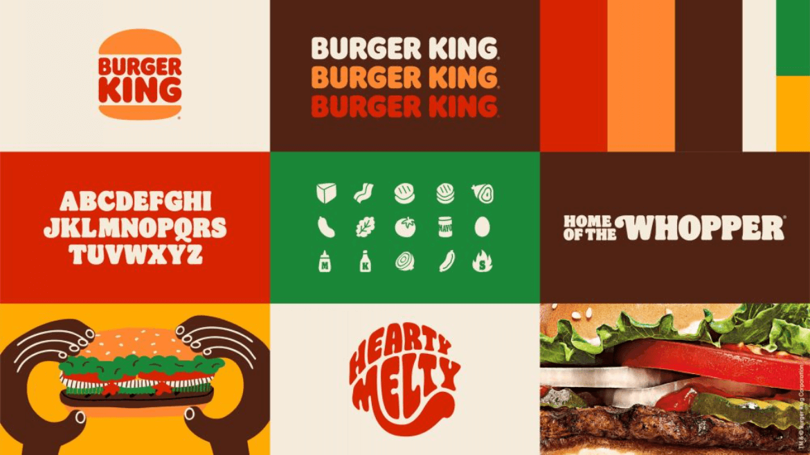
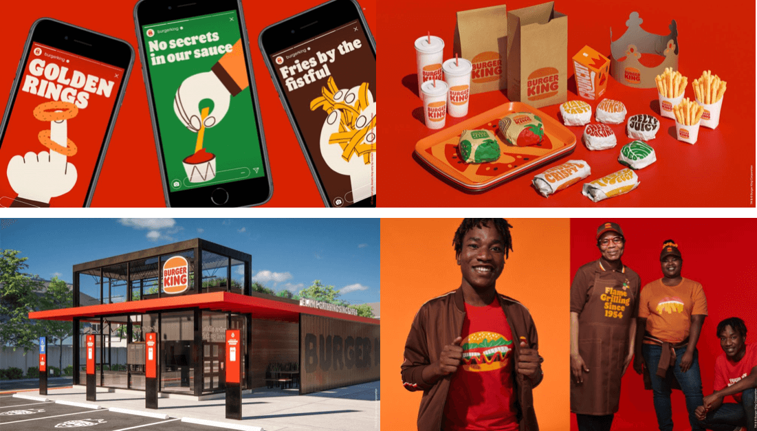
![]() Some of us are old enough to have grown up on “the King” since its earliest days. So we are nostalgic about the brand. And the original logo, including its color palette and typeface, are definitely the inspiration for the new look and feel. The transformation also includes packaging, signage, apparel and their brick-and-mortar restaurants.
Some of us are old enough to have grown up on “the King” since its earliest days. So we are nostalgic about the brand. And the original logo, including its color palette and typeface, are definitely the inspiration for the new look and feel. The transformation also includes packaging, signage, apparel and their brick-and-mortar restaurants.
After two decades, the fast-food giant has retired its multicolor logo and gone back to basics. The 2021 update serves to make the brand less synthetic and artificial, and more real, crave-able and tasty. Owing to its “flat” design (in other words, two dimensional), Burger King now looks even better on-screen. It’s a key touchpoint where many consumers interact with the brands they love. Above all, the company behind Burger King (Restaurant Brands International) wanted to spotlight the thing that makes the fast-food chain unique—the ingredients.
How the logo supports the product
The new logo was a big part of the rebranding. The new mark looks stripped back but more suited for a food brand. The simplicity of it reflects the trustworthiness of the ingredients. The warm color palette found inspiration in the food and preparation of items on the menu. The yellow is that of melted cheese, the brown resembles the perfectly flame-grilled patties, and green is like what you’d see on a crunchy piece of lettuce. Even the typeface is juicy, rounded and appetizing.
The trend toward flat design and simplification permeates rebrands across industries. They are not only motivated by the desire to be digital- and screen-friendly but also to convey their philosophical message. A good example is General Motors, once affectionately called “GM” will now be called “gm” (the lower-case letters are key).
![]()
An eye-catching bright blue and a softer border are used to modernize the new logo. The old logo with thick white letters on a navy background has remained largely the same since 1964.
GM joins the ranks of many other auto manufacturers who are stripping down their branding to usher in a new electric and digital era. Flatter, sleeker and more streamlined, the new lower-case GM logo is said to represent the “clean skies of a zero-emissions future” and the “energy of the Ultium battery platform.” We LOVE it.
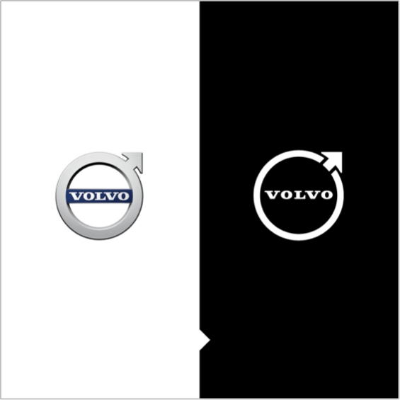 Volvo’s rebrand is another creative team favorite. The company believes the flat, less colorful logo is a more “modern” reinterpretation of its long-standing Iron Mark logo. It still retains the same circular shape and upward-pointing arrow first used by the brand in 1927. Snaps for connecting the new logo to the brand origins effortlessly.
Hugs and kisses to a couple more
Pringle’s “Mr. P” is now 54 years old and as handsome as ever. The new logo gives him an expressive pair of eyebrows and an oversized red bow tie. His look has been described as more “emoji style” in keeping with today’s social media trends.
Amidst a surge of recent attention, Pfizer unveiled a new logo and symbol outside the old capsule design (another trend is unenclosed logos). 2021’s new logo has a dynamism missing before, while familiar font elements retain the brand’s legacy for the coming decade.
Velveeta’s refresh is the first major update to the brand in two decades. The logo is now free of the “liquid gold” tagline, the broken circular frame and the underline along the bottom of the brand name. The Velveeta wordmark flows like liquid cheese with its round shapes and speaks to the indulgent pleasure of pouring cheese sauce all over your food. And we happen to LOVE cheese sauce.
![]()
Would a refresh benefit your brand? Find out in a free consultation. We love to help!


Leave a comment: