

How we changed the landscape with a new brand family
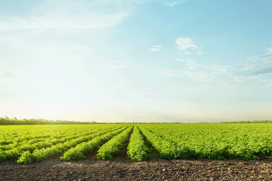
Brand families are exciting projects for us as creative professionals. They require visual and verbal connections to communicate their relationship to each other as well as their shared and unique characteristics.We were thrilled to take on developing an extensive brand family for Renewable Earth. The company produces custom-blended compost and soil solutions vital for healthy agriculture and horticulture across the entire state.
First, we set to establish the identity for the parent brand. Creative director Ryan Hall reveals, “We chose typefaces and color choices appropriate for the sector. Think of walking down an aisle at a big-box garden or farm supply store. Renewable Earth would be competing with all the mulch, compost and soil amendment brands in that arena.”
Hall and his creative team chose a type he describes as intelligent. “We didn’t want anything too playful. Our palette consists of greens and blues. Water and vegetation, the two primary elements essential to Renewable Earth and its products.”
Next came naming exploratories. We crafted Renewable Earth’s product names to stand on their own, primarily to be descriptive of the ingredients, intended usage and benefits to customers. Copy director Robert Armstrong led this effort. “Not only did we want all brand names to be unique, but also trademarked. Researching existing protected names is a vital step in the branding process,” he remarks.
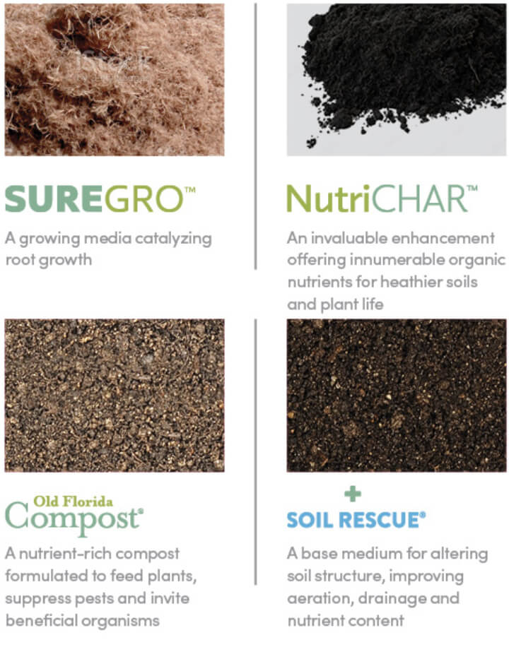
Ultimately, we finalized the selections:
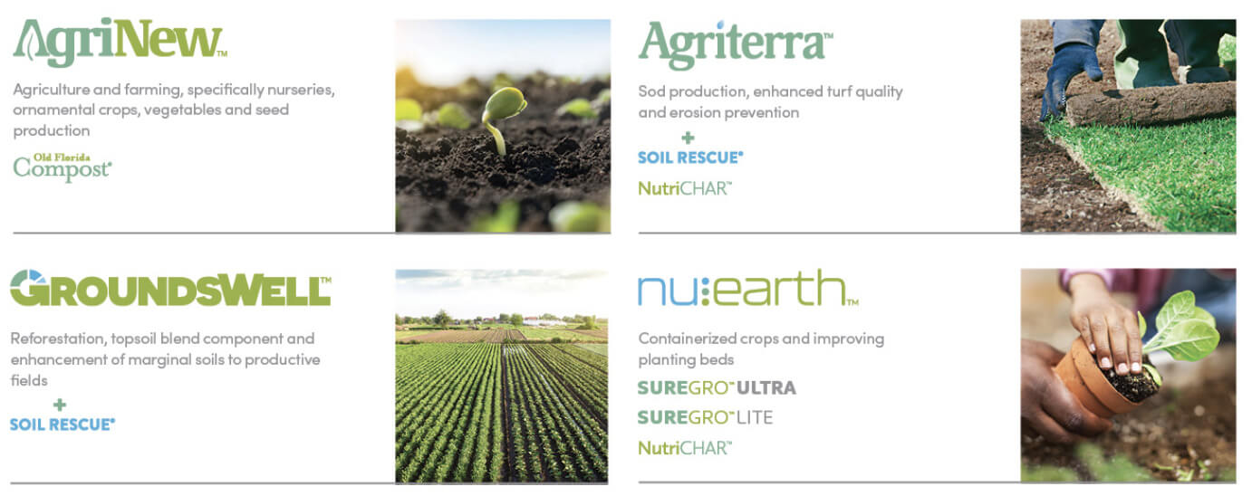
 With descriptive brand names in place, we established a brand system like an actual family tree showing the hierarchy of every product. The names are reinforced by iconic typography. “For example,” Hall describes, “Notice the A in AgriNew and how it frames the leaf icon from the parent logo. AgriNew has a wide range of uses and applications supporting healthy plant life. The water-drop-inspired ‘i’ in Agriterra expresses how it enhances moisture retention in soil.”
Thinking big was crucial for making an impact and ensuring the success of the brand family launch. Development began in early September 2021 and was completed in January 2022. The Renewable Earth family is tied together by a carefully chosen color palette and logotypes with applications in mind such as packaging and sales collateral.
We relish any opportunity to leverage our experience, skills and resources to make this world a better place. Especially given our vibrant, subtropical surroundings where wildlife is ever-present and our gardens and yards are abundant with trees, fruits, flowers and exotic plants. Our concern for (and love of) the environment put this branding project close to our hearts.


Leave a comment: