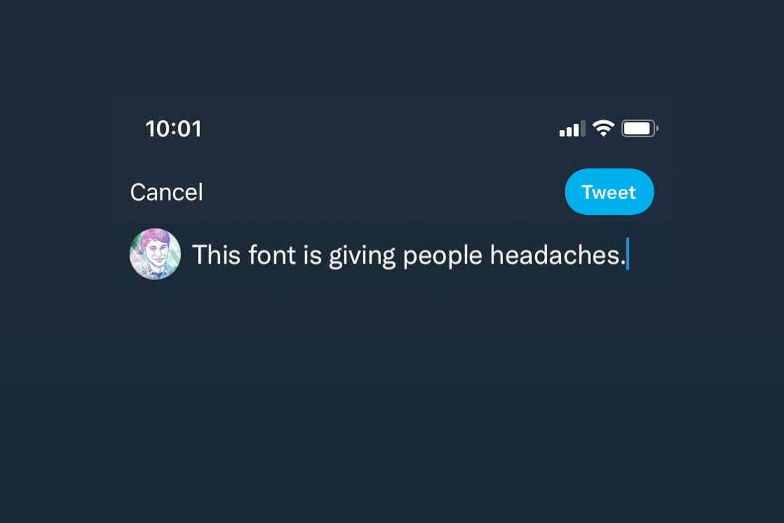
On Thursday, Twitter updated the design of its app and website. Some users were baffled by a change to the “follow” and “unfollow” buttons that could lead one to mix them up. Others took issue with the new Twitter font, Chirp. While the social network boasted that Chirp is designed to be more accessible and amplify “the fun and irreverence of a Tweet,” many tweets complained that not only is it harder to read, users are complaining of headaches.
To better understand what’s going on with this font, I spoke to Fredrick Brennan, the founder—and later the antagonist—of 8chan. He launched the infamous imageboard in 2013, but then embarked on a crusade to get the notoriously toxic site shut down. Nowadays, Brennan designs open-source fonts. As someone who’s created his own social media site (with regrets), designs fonts, and tweets prolifically, Brennan has been fairly outspoken about Chirp. Our conversation has been condensed and edited for clarity.
Aaron Mak: What were your first impressions of the Chirp font and initial complaints about its readability?
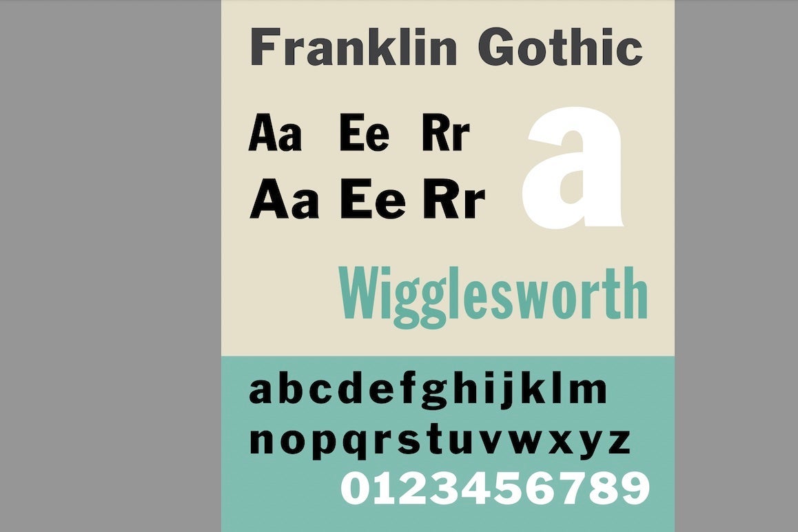
Fredrick Brennan: Back in January, how it was announced was that Twitter had commissioned this bespoke font. That turns out not to be the case. The font that they’re calling Chirp is extremely similar to GT America, which is itself based on Franklin Gothic. They changed the spacing ever so slightly and changed the square dots over i and j, and then the period and comma to be circular. It definitely was not as advertised.
In terms of readability, I would say that typeface readability is not really an exact science at all. The results are not often repeatable. What people find readable tends to be more cultural and experience-based than anything. For example, in the Middle Ages, people found Gothic lettering to be extremely readable, right? The human brain is flexible enough that it can learn how to read any kind of script, and then when you try to present it with one that’s differently designed, it will find that challenging. So when people say that they find the new letters more difficult to read than before, my first assumption would be that that’s only because they’re so used to seeing Twitter’s previous default font.
Does this actually seem like an upgrade from Twitter’s previous font?
I think that would more depend on the operating system that users were coming from. If you’re an iOS user, which most Americans are, I would say no. San Francisco, which is Apple’s font, is very technically complex and very pleasant to read. Not only that, users are very used to reading it now. It would essentially be like the Times Roman of this time, where people’s eyes are so used to it that any change to it is going to immediately cause a decrease in perceived readability. If they give it [Chirp] time, they will eventually experience the same amount of readability. I quite like it, but again, that’s extremely subjective.
Another thing is, talking about multilingual support, if you’re using the operating systems’ default fonts, those are all meant to work with the fonts on that operating system for different languages. So if you have a multilingual text or even a text that just includes one Russian word or one Greek word, that will flow a lot better than if Twitter tries to put its proprietary font in there. [Chirp] doesn’t have a Greek or Cyrillic character set. I kind of view Twitter as cheaping out in some ways that they didn’t support the three basic character sets: Cyrillic, Greek, and Latin are often abbreviated as LCG in the type industry, because they’re just expected. It’s strange that they would undergo this expensive thing and then not have that. It’s possible that they spent all this money on the font for advertising, and then they didn’t really let people that were working on it know that they were going to roll it out across the entire site.
Is there anything about this font that might make it suitable or unsuitable for tweets in particular?
I would say that this font does have kind of a midcentury feel, because it’s based on Franklin Gothic. That was a font that was very often used in newspaper headlines and magazines especially. If you look at old Time magazines, you’ll see it all over the cover. Probably even people who wouldn’t necessarily be able to look at the font and tell you the name of it still recognize that it kind of reminds them of a magazine or a newspaper from when they were little. It bucks the trend among a lot of tech companies that, when they are rebranding, they will always try to come up with a totally new design, not based on a past design. It’s usually something very geometric; you can think of Google’s proprietary font. That tends to be more of a safe pick. I think maybe users have certain expectations for which type designs they will see on screen. One that’s based on Franklin Gothic might break a lot of those expectations.
Twitter has been advertising this font as being more accessible. Does it seem that way?
I don’t think so. And as I said, I view the entire field of those studies that try to say one font is more readable than another as extremely suspect. There’s just a total lack of repeatable results. There’ve been studies that have been designed and shown that Comic Sans is better for dyslexic children. And then another one will come out in favor of OpenDyslexic, and then another one will overturn those results. I don’t know that a designer can mess up a font so badly, if they’re trying not to, that they can create an unreadable font by doing that — certainly with a font like this that is based on Franklin Gothic, which people have been reading for over 100 years. With the absence of printed materials, we’re not seeing it as often, but I do think that people will get used to it. I don’t necessarily think that Franklin Gothic is an especially unreadable font.
Were there any other technical flaws you found, besides the multilingual issue?
I saw a thread about how somebody was complaining about the hinting. I looked through the file and I confirmed that there was a problem. Hinting takes the outline that’s in a font and it tries to move the points around to make it so that the points will match up to a pixel grid. If this doesn’t happen, you can get what a lot of people are seeing where the outline will be misaligned. It will look like some letters are one pixel too tall, and some letters are one pixel too short.
Normally, if you’re designing a font for screen use, this is a big deal that you have to think about. I don’t know why [Twitter] didn’t. This definitely points to them cheaping out. This is something really fundamental and basic to type design. The other issue that I discovered in this font, which kind of points to them rushing it out, was a grave accent issue with all the white space after it. [The accent has roughly twice the amount of space after it than there should be.] I’m not saying I hate the font. I do think they can fix it, they probably will, but I don’t understand how with their budget this happened.
Were there any quirks in the font design you noticed?
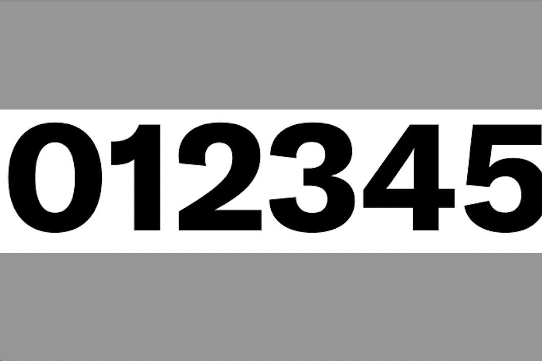
I do think that some of the numerals were strange; especially the numeral 2 looked quite strange to me in relation to the others. If you have 1, 2, 3, 4 laid out, you can see that. If you look at this specimen of Franklin Gothic, you can see that [Chirp’s] numeral 2 definitely departs, and not all of this departure was good or necessary. You can see that the top part of it definitely curves inward a lot. I found that to be strange and quite honestly ugly. I would not have departed from the original design in that way.
When it comes to fonts like this that are sensory and meant for reading, you’re never going to see huge differences and grand leaps taken.
What was your favorite character in the Chirp font? What was your least favorite?

This lowercase g, I noticed a lot of people complaining about it already, and it is very different than a typical, lowercase g. They have in the font file an alternate lowercase g, which looks more normal.
It seems like they were planning for some kind of outcry here so that they could quickly replace these g’s, because none of the other letters have this. I could be wrong about why they did this, but given that I’ve seen so many people complaining about the g, I wonder if they did a focus group and found that this was the thing that kept coming up. It’s normally quite strange to see those alternates. That kind of betrays, in my opinion, a lack of confidence in the design that they thought they would have to change this g. I would say that the g is both my least favorite and most favorite, because I do think that it’s a bold design decision. I see that it’s getting people talking.